

A new Nordic icon.
When I joined THANK YOU STUDIO, they had recently ventured into new territory — starting a distillery from scratch. As their head of copy, it was up to me to create a solid tone of voice for the new brand and handle the image outwards in collaboration with the senior designers at the agency.
Creating a new Nordic icon.
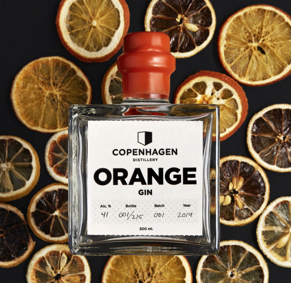
Dry Gin was the first product launched by Copenhagen Distillery. It needed to be a signature item, to stand out and fully express the distillery’s ambition to make high-end products in a new way.
To make the gin, the distillery drew inspiration from the Nordic tradition of simplicity and balance. As the designers, we wanted the overall design of both the bottle and the label to emphasise functionality, focusing on balance, scale and textures. The bottle itself being the logo for the distillery.
Each bottle, after being corked, is then dipped by hand into coloured beeswax, sealing it. Making each gin unique in appearance.


Copenhagen’s first ever Whisky.
A passion for whisky is what originally brought Copenhagen Distillery’s founders together. The Master Distiller, Henrik Brinks, carefully distilled and looked after their very first single malt whisky for ten years. The result is Copenhagen Distillery’s First Edition, a single cask of outstanding and quite eccentric whisky.
To create equally eccentric and exquisite packaging, we sought collaboration with renowned Danish glassmaker Holmegård. It has no straight surface and the label is hand-carved, each bottle numbered from 1 to 99, making each and every bottle truly unique.


